Mano A Mano family center
Brand Identity
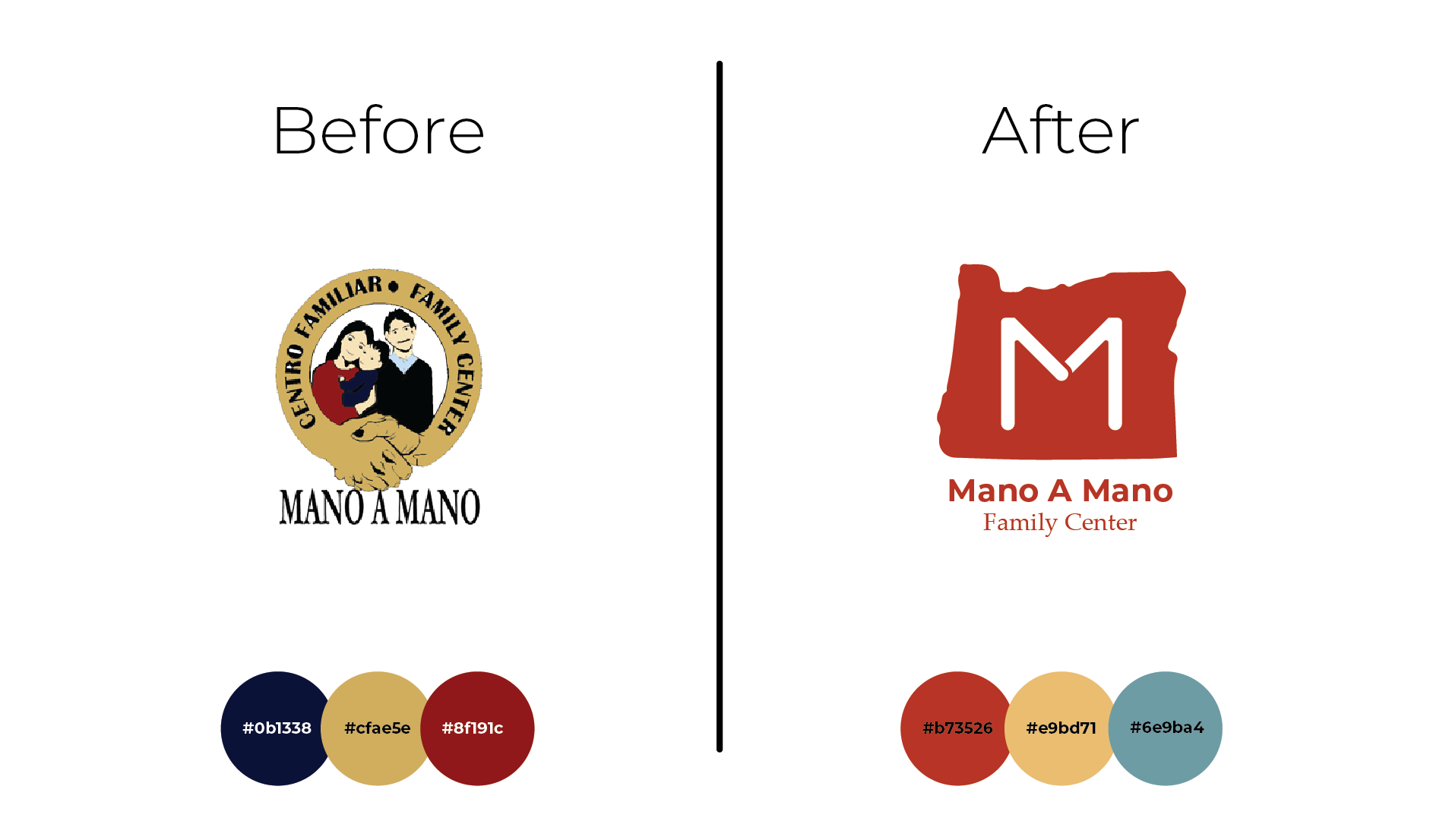
Mano A Mano Family Center has a long-standing presence in the Oregon community, and redesigning their brand while honoring that history was both a challenge and a privilege. I refreshed their identity with a more modern look while preserving key elements of their legacy, reflected in their updated color palette and overall design.
Mano A Mano | Brand redesign
-
Founded in 1988 to support migrant farmworkers during a difficult harvest season, Mano a Mano has grown into a cornerstone community organization in the Salem-Keizer area. Over the past three decades, it has fostered youth leadership, championed immigrant rights, advanced educational equity, expanded community health services, and partnered in regional initiatives that strengthen families and neighborhoods. From launching youth empowerment programs and sponsoring advocacy groups, to responding to crises such as wildfires, the water contamination of 2018, and the COVID-19 pandemic, Mano a Mano continues to stand hand in hand with the Latino/a/x community, building resilience, leadership, and opportunity for future generations.
-
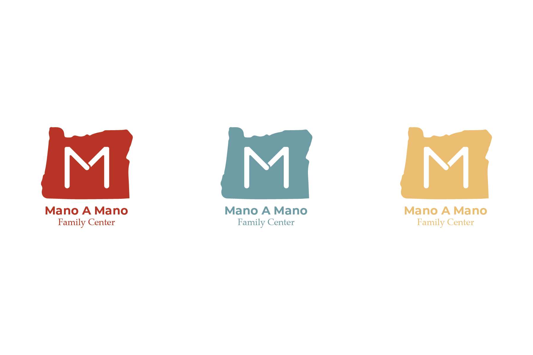
For this logo design, my focus was on highlighting Mano a Mano’s Oregon roots while creating a mark that would remain instantly recognizable across all uses. I aimed to preserve the meaning of “Hand in Hand”, a symbol of unity and community, by integrating the letter “M” with the imagery of people holding hands, connecting the organization’s identity back to its origins and mission.
-
For the color palette, I modernized their existing scheme while introducing a new blue tone. My goal was to honor Mano a Mano’s rich history by preserving the essence of their original colors, while refreshing the palette to feel more contemporary and versatile.
-
For the typography, I selected two complementary fonts to give the logo a modern yet minimalist aesthetic. Montserrat was chosen as the primary typeface to reinforce a contemporary look, while Palatino Linotype serves as a secondary font, a refined, modernized nod to the original typeface used in their identity.